© Rune Andréasson
Story: Rune Andréasson
Pencils: Andreas Qassim
Ink: Bernt Hanson
Coloring: ?
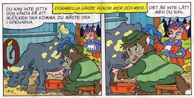
Subscribers got Bamse #14 in their mail-boxes today. I was about to behold the end result of three months unusually hard work on my one, and perhaps only, Rune A-story. I was excited like a child on Christmas… just to be utterly disappointed seconds later. The coloring of my art work is eh… uninspired, to put it mildly. Did you ever see a dark-grey cow with pee-yellow patches for instance (p 28). And her name is “Rosengull”! (indicates an entirely different color scheme)
The Middle Ages feel I worked so hard to create, in accordance with Rune’s lovely design sheets, has been corrupted by crazy color combinations. Walls are blue or green, wooden barrels are purple, armor suits are yellow etc. There are far too many classic “donts” like red on red, blue on blue or color hues too close to each other.
I envisioned a more naturalistic looking environment than usual with toned down colors (I thought Rune’s design sheets indicated this). This would have added to the Middle Ages feel and the characters would have stood out more from the bkg. Instead we find this crazy mix of colors that just don’t go together. The choice of colors generally lacks harmony. And what’s boring is that nearly all the foxes’ fur is the usual bright red. If Rune’s design sheets indicated anything it was variation. What’s variated instead is the clothes of the minor characters. To such an extent that the eye actually hurts…
The only thing I’m pleased with when it comes to colors is the cover. Brilliantly composed by Joakim Gunnarsson and drawn by Lars Bällsten, the cover is further lifted by its warm and juicy colors. Why are the colors excellent on the cover and not so excellent on the inside? Because the covers are colored first-hand at the editorial office! These guys know the story and they care about it. Those who color the contents of the magazine work from abroad. They are not 100% familiar with the story and probably don’t give a damn. At least that’s what it looks like.
This indifference makes me unkeen to continue going to such painstaking lengths to produce art work true to the original vision. When it’s not met with similar engagement at the coloring department, it doesn’t seem to be worth it, and I might as well choose the easy way out.
/a dissapointed comic artist
Eh, um, the “brilliantly composed drawing” on the cover is actually composed by me… So, thanks! 🙂
Man sorry to hear that specially after knowing how much you looked forward to this particular script. Think we need that color dept. to undergo Mr. T’s “I pity the foo'” bootcamp for uninspired color artists.
Thanks, bro! I know, Mr T would’ve been the perfect remedy. Jocke, thanks for straightening things out regarding the composition of the cover. I’ll be more careful next time! 🙂