Yesterday I picked up the comic books from the print house. Big day. I’ve invested so much in this, so I was quite nervous about it. My 1,5 year old son helped me carry the boxes. Got to reward him with an ice cream. Poor guy.
Anyway, it was a big relief to see that things actually worked. And they worked beautifully! Choosing the slightly more expensive offset print paid off. The book oozes of “retro”, and the printing technique is the icing on the cake. Just the smell of a newly printed book you know? It looks quite incredible, if I may say so myself. Just like I wanted it!

In the evening, Pacifiers scriptwriter Jimmy stopped by for a taste of the magic, and some patting on each other’s backs for a job well done. And some whiskey too.
Making the book was a lot of work. I knew it would be, and I knew the money from the campaign wouldn’t be enough. But I realized somewhere along the way that there simply MUST be a book, and that it will be worth the extra cost. Holding the book in your hands, flicking through it, is something else than reading it on screen. And now that I’ve got it, I can start the quest for the next chapter of this adventure, in a way that would’ve been more difficult with just the webcomics. At least I hope so.
Making the book
First thing I did was the chapter covers. I wanted to make them like title cards in animated shorts of the past. At first I wanted them painted, but then I thought it would be better if they matched the color style of the comics (same 64 color palette, color separation and dots), which leaves them somewhere in between comics and cartoons. I guess that goes for The Pacifiers comics in general, a mix between old school cartoons and old school comics:

The cartoon savvy among you can probably see where the inspiration for the cover above came from. 🙂

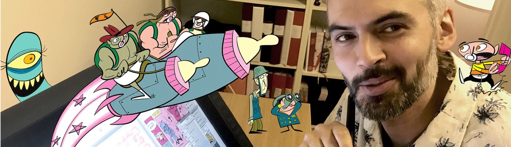
It was Jimmy’s idea to present the characters of the episode like they used to do in EC comicshorror comics.

The Cover
Then the biggest challenge was the actual cover of the book. Covers are arguably the most important pages of a book, since that’s what supposed to make people having no previous knowledge of the content interested. My first attempt:

“Nailed it”, I thought. For a while at least. For me, this is the core of The Pacifiers: children standing up against evil in the adult world. It’s got the drama and the dynamic. It looks interesting. But then I felt there was something missing. It doesn’t look fun enough. The Pacifiers isn’t just superficially funny, there is seriousness beneath the silliness, but the main thing is it’s supposed to be funny and entertaining. And Jimmy hit the spot by saying “having the kids in their kid form on the cover of the first Pacifiers comic book would be like having Clark Kent on the first cover of Superman”. Not that their identities is such a big secret to the readers, but this cover doesn’t really tell us what’s so special about these kids. So I ditched it and started over. This time I went for something simpler. A sense of action and fun:

It could’ve been nice with an action scene involving all three Pacifiers, but close ups are kind of eye catching, and they allow you to push the expressions. Pacifiers is a lot about acting, character animation, poses and expressions. So I think this cover does the job better. My wife said at some point she thought the purple lady is really scary, so I put her up against Abe. Also with the kids in their kid form in the “starring” circles, there’s a hint that there is some sort of secret identities involved. I hope this cover will make people curious. “Hey, this looks fun! Who are these weirdos?”
More Work
Then it was the introduction text that I made so many versions of. I had people that I trust proofread several times. This is my one shot at making something special, so the text needed to communicate that sense of urgency. If I never make another comic book, this will be my testament. That’s been my attitude towards this whole thing. I really can’t do any better than this folks. Take it or leave it. The Pacifiers is also something highly personal, so I wanted to be personal. But not too pretentious. And funny if possible. Man, texts are hard.
What I probably spent most time on however was things like making the artwork safe for print, changing the format several times, adjusting the artwork for the new formats, making the text sharp (thank you Ola Forssblad of Homemade Comics for that piece of valuable advice), choosing the right kind of paper, researching print houses and print techniques and other things you won’t see. But hopefully, getting these things right will heighten your experience of holding this labour of love in your hands!
The icing on the cake
Wait a minute, the icing on the cake wasn’t actually the offset print. I’ll tell you what the icing on the cake was: The blurbs, or the quotes on the backside of the book. They were written by none other than Joe Murray, creator of Rocko’s Modern Life (the cult animated TV show from the early 90s) and Mike Quinn, who played Nien Nunb in Star Wars (you know the alien flying the Millenium Falcon together with Lando Calrissian in Return of The Jedi, blowing up the second Death Star) and who’s been a Muppet performer since Muppet Show times. HOW COOL IS THAT!? I can’t tell you how thrilled I was about this. Like a kid at christmas. I got Mike’s text one hour before I sent the book to the print house! Can you imagine? And the things they wrote were so sweet. You know what, there ARE friendly people in this world.
But how on earth did I get these giants to write blurbs for my little book? Maybe I’ll tell you in another update. 🙂
Yours truly,
Andreas