Bamse #15 just hit the shelves. Lead story “13” was written by Joakim Gunnarsson and Jens Hansegård, and illustrated by me. It’s not only the first Bamse story I inked myself, it’s my first digital comic. Ever.

After an intense year working for the Bamse feature film (opens January 2014), I needed new challenges to be motivated continuing drawing for the comic. Also, the analogue work of the film (pen and paper) left me romanticizing about the wonders of the digital world. All the tricks and shortcuts you can cut corners with digitally, especially when it comes to editing. So I got myself a Wacom Cintiq, you know the drawing tablet with a screen you can draw directly on.

I set myself the task of both pencilling and inking digitally. The first few weeks sketching were like trying to learn to walk again. Spent a lot of time fiddling around with brushes and pencils and settings and layers. Very frustrating as it didn’t save me any time. Not at all. One sketched page took forever to finish.

However, some kind of method evolved gradually that eventually seemed to do the job. And so in the end I finished the sketches and remarkably they were approved by the editors.
Then came the next challenge, which was twofold: 1) ink a full Bamse story for the very first time, and 2) do it digitally. Inking 16 pages is not a small task if you’re not used to inking. Again I spent a lot of time fiddling around with settings and got frustrated. Very frustrated. But you know what the say, if at first you don’t succeed…

In the end 16 pages were inked, signed, sealed and delivered, and everybody lived happily ever after. Don’t know if I saved any time in the end. Not through inking, that’s for certain. The main challenge of all this was to make it look non-digital. I think it worked pretty well. What do you think?
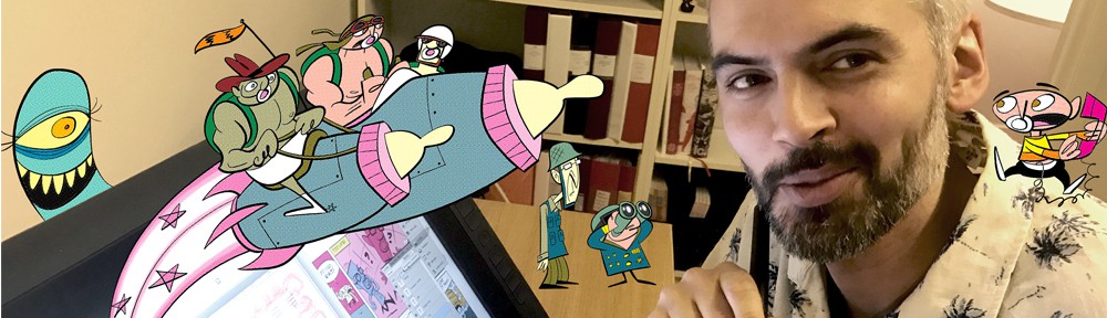
Aside from beginner’s slowness, the freedom to edit – move things around, scale heads and characters, copy and paste things for reuse – is something quite nice when making a comic. This is what my work space looked like. I used Photoshop CS4. Bridge is open in the background to compare with previous pages. The resolution needed for print is 600 dpi. For sketching I sometimes used a brush resembling a pencil, sometimes a pencil with ca. 50% opacity. For inking I used the pencil. Confusing? It was for me at least. For ink lines to look crisp and sharp in print you want only black pixels, no anti-aliasing. The only important setting to remember? Pressure sensitivity (thick and thin lines).

According to me, cmd z (ctrl z on PC) is the greatest thing about the digital revolution. You’re allowed to fail, fail and fail again, before you succeed. However, cmd z is a double edged sword. If you have a knack for perfectionism (you know you can zoom in a bit more, fixing those ugly looking lines), there’s the risk of NEVER settling for the first try. You’re free to redo things infinitely. With pen and paper, at some point you need to stop erasing, and stop repairing mistakes in the inking, and just accept that it is what it is. Still I think I prefer the editing possibilities of digital drawing. If you learn to master the technique you can make your work look MORE you rather than less, allowing for your own idiosyncrasies, not trying to get rid of them. Can’t see myself going back to pen and paper anytime soon, not for Bamse anyway.
All drawings in this post is © Rune Andréasson.