Final Kickstarter Update: What is The Pacifiers?


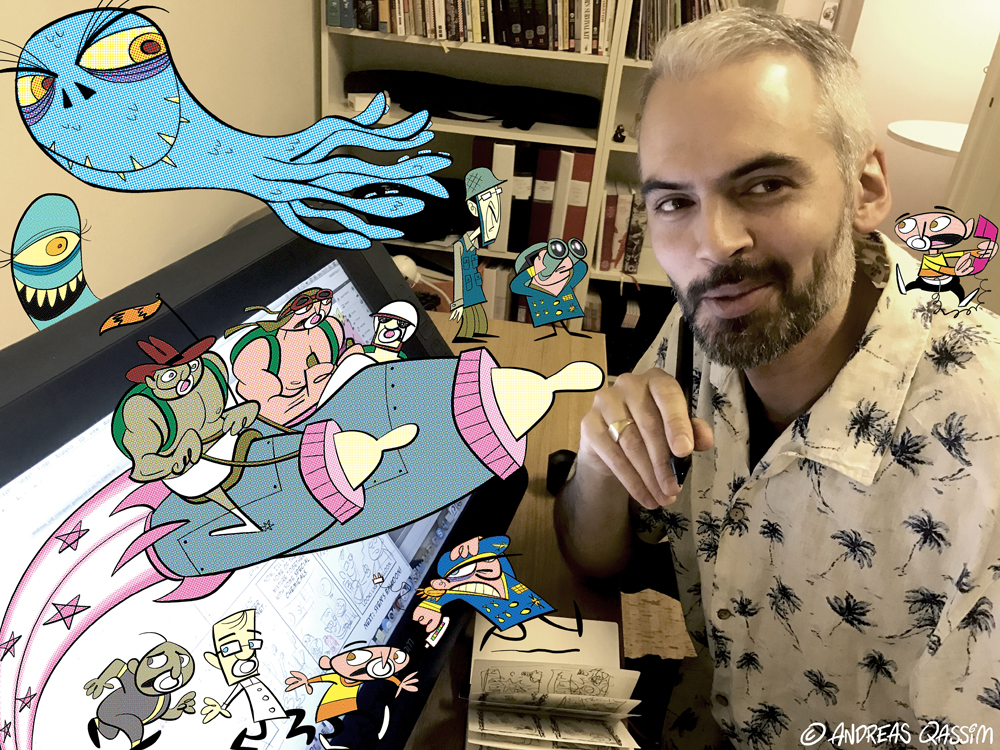
By now, most of you should’ve got your rewards. I hope you’re happy with them. A lot of love and sweat went into those items. Hey, I never designed a whole book before! What a ride that was. I learned a lot in the process. Getting the quotes from Joe and Mike in the final hours before sending to print really was the icing on the cake. Make sure to check those out on the back of the book. I’ve yet to finish the PDF. Basically it’ll be the book plus sketches and stuff. It’ll be ready any day now…

Signing and posting books and stickers and posters and T-shirts to all corners of the world (USA, Canada, Abu Dhabi, Taiwan, Australia, Denmark, Norway, Switzerland etc.) was a time consuming and costly exercise, but fun. 🙂

If you didn’t pledge at the “get the book” level or above, but since then you’ve come to realize just how awesome this is and now you’ve built up this huge craving for the book, here’s your chance: I’m now selling the remaining books through The Pacifiers Store. Limited edition, so don’t wait too long. And please help spread the word! I spent a lot of my own money to get this project finished, so every sold book will aid me in my financial convalescence. The Pacifiers: Pacify The Bullies! is the perfect gift for a friend or family member!

Two backers didn’t provide me with their addresses, and one never claimed his reward at the post office, so it was returned to me. I’ve e-mailed the three of you and hope you’ll get back to me eventually. Your goods is waiting for you!

I wanted to conclude this crazy one year journey by trying to summarize what The Pacifiers mean to me.

What is The Pacifiers?

Well, to me they’re actually a lot of things. Here are some of them:

Reacting to the world
Artistic expression is usually a reaction to something. The Pacifiers could be said to be my reaction to a depressing contemporary world. For the last 15 years or so we’ve gone from hope for progress to hope for survival, on a global scale. When I started developing The Pacifiers back in 2011, the Arab spring was in full swing. I fantasized about deploying these peace troops in The Middle East, having them deal with the dictators of the Arab world.

They way things have turned since then, perhaps there are others today that need to be pacified more urgently: populists, far right people, macho men in politics, war mongers, weapons manufacturers, proponents of warrior ideologies, internet trolls etc. With The Pacifiers I’ve created a lethal weapon that I could use against anything and anyone I don’t like (and they are many). It’s a weapon that will strip the violent of their violence, the angry of their aggression, the ignorant of sharing their faeces and so on. BUT, these lofty goals must never be top priority. One of Jimmy’s greatest contributions to The Pacifiers was: “Yes, your ambitions are great, but let’s boil them down to something simple that will make people smile”. So that’s what we did, together.

Learning to have fun again
Back in 2010 I was fed up with cartooning. I was stuck in a way of drawing that simply wasn’t fun. And drawing is supposed to be fun, right? First I took a course in 3D character animation, hoping I’d never have to touch a pencil again. The course was great, and I proved to myself that someone like me (a technical illiterate person) could actually learn to do decent 3D animation in a few months. As time passed however, I realized I was sitting on a winning lottery ticket: drawing. I should use drawing to my advantage, rather than trying to compete with the hordes of talented 3D people out there who grew up on 3D like it’s the most natural thing. But not all of them can draw.

In 2011 I stumbled upon a book in my local art store. It was Joe Murray’s Creating Animated Cartoons with Character. It inspired me to such an extent that I signed up for his summer course in 2011. That’s when I started to develop The Pacifiers. Joe’s method in short: start with the characters, then build a world around them, and from there extract stories. Joe emphasized joy and having fun. The starting point should be a bunch of characters you actually like drawing. From the get go I had fun with these babies, and that feeling is still there whenever I draw the Pacifiers. I learned to have fun at my drawing board again, and that’s maybe the greatest achievement with this project, to me personally. Some early sketches of Abe, 2011:

The style of The Pacifiers was also a kind of final showdown with my previous 10 years of cartooning. Strict design rules, meticulous constructing, restricted acting and expressions, pretty lines, solid 3-dimensional characters, naturalistic-ish backgrounds and objects, naturalistic-ish colors (tree trunks are brown, rock is grey, grass is green). With The Pacifiers, I wanted to break away from all that. Go to extremes, exaggerate, flatten, stylize, caricature, abstract, go nuts. Like they did in the 50s and 60s in animated and editorial cartoons. Learn the rules, then break them, without mercy.

But it’s not about copying stylistic clichĂ©s, it has more to do with certain principles. One of the best compliments I got was: “You can tell from where you got your influences, but you made something uniquely your own out of it.” Another one I got from a highly respected cartoonist colleague: “It looks sloppy.” That might not sound like a compliment to you, but to me it was, a big one. It confirmed that I finally managed to break up with my own goddamn perfectionism, my biggest enemy.

What if I could be big?
I wasn’t bullied as a kid. Sure, I was often teased, especially by the older kids in school. For some reason I provoked them, maybe because I was good at drawing, I don’t know. But then again I was sometimes the one who teased those smaller than me. I was by no means an angel. The schoolyard can be a rough place. As I moved into my teenage years I realized I would never be one of the cool guys. I tried to for a while, but it wasn’t for me.

When my peers started drinking and going to clubs and having girl friends and all that, I hung out with my partners in nerdery, Pato and Johan, playing games and making weird films and hiking on small islands. We were quite a trio. One Swedish-Yemeni, one Chilean, one German-Swedish. Pretty different personalities, but united by our nerdy interests. It didn’t occur to me then, but looking back I can see that I always gravitated towards people with a somewhat different background. My best friend during earlier childhood was from Thailand.

Johan and Pato in a snow cottage a.k.a. The Spaceship, ca. 1990.

I particularly remember one episode from high school where this cocky little guy, a couple of years older than us, tried to pick a fight with Johan. Johan was the most safe and secure and non aggressive teenager you could imagine. He wasn’t interested in fighting. This pissed of the cocky guy. He was probably one head shorter than Johan. The reason he dared to attack Johan was he had his two huge friends behind him. He pushed Johan into the lockers saying “don’t look at me”. Johan said he wasn’t looking at him. The guy kept on pushing, saying “don’t look at me”. Johan did not swallow the bait. Eventually the guy realized he wouldn’t get his fight, so he and his friends left. I don’t think Johan was as scared as I was. I was trembling. Someone tried to hurt my friend, and I was too chicken to interfere. What if I could be big…?

That what-if is key in The Pacifiers, empowering those who want to but don’t dare. And perhaps a kind of Revenge of the Nerds type of story. “So you think you were cool when you were 15 and dated the prettiest girl in school and got drunk and went out to town on Friday nights to fight? Well now you’re sitting there in your suburban house with your beer belly and watch sports and play on internet casinos. You’re the looser and we’re the cool ones.”

THE REAL PACIFIERS: Andreas (Abraham), Patricio (Rodriguez), Johan (Svendemar)

Childhood
Finally, The Pacifiers is a celebration of the magic of childhood. I had a good childhood. It was a complex mix of good experiences and bad, like life in general, but the bright memories are the ones you tend to remember. My Mum created room for me to play and make friends and dive deep into the things I was interested in. For that I’m eternally grateful. The Pacifiers is full of the things I loved as a kid: friends, comics, TV, film, action figures, games, drawing, creativity, adventure. If you look at it you’ll find references to various 70s and 80s franchises. Jimmy understood this element of nostalgia perfectly and emphasized it in his scripts, without letting it take predominance. Funny and exciting stories was top priority. There’s a playfulness there that felt just right for what I wanted to create. The Pacifiers is all about playing and having fun. And people I like. Just look at all the cameos by friends and family who so dearly and generously supported this project. I love you all!

Sloth and Mama Fratelli read Pacifiers at Scifiworld, Gothemburg. Photo: Jimmy Wallin.

A note on gender
I fully understand if someone questions The Pacifiers on a gender basis. Why are they all boys? In fact, the whole nursery is full of potential Pacifiers. The kids populating it are based on persons I knew as a kid, from school mostly. From the beginning I imagined all kinds of different Pacifiers, girls and boys. A kind of Masters of the Universe toy-line with babies who when they transform get special abilities based on their personalities. However, when I started developing The Pacifiers through Joe’s course I chose to base the main trio on my best friends. Since I know them the best, there’s an endless well of material there to pour from. I love this trio and I care deeply about them. That’s key in a silly set up like this. No matter what ridiculous things I expose them to, I need to be 100% serious about it.

I’m not ruling out the possibility of lifting others from the nursery to become future Pacifiers. Again, there’s an endless well of possibilities there with all those whacky personalities. For now though, it’s Abe, Rod and Sven. And if you take off the gender glasses for a while you’ll see there’s a diversity there, for instance in their ethnic backgrounds. But that’s not a statement, that’s just who we happened to be. And if you look closely, these guys are everything but macho. Being big with muscles is really just a gimmick, it has no function, except it looks kind of weird and funny. The main thing is to empower these little guys, having them battle all the bad guys out there. Not with violence, but with pacifiers. Kindness. Friendship. Peace and love. What the world needs.

From an article about me and the muscle babies in HallÄ Lund! Photo: Luigi Zito.

And with that, on behalf of Jimmy and Alfred and myself, I say thank you. A big and heartfelt one. YOU made this happen. Together we Kickstarted The Pacifiers. There WILL be a continuation, but presently I don’t know when or in what form. But whenever things start rolling again, you’ll be notified. Who knows, maybe I’ll be insane enough to do another Kickstarter?

Take care and be nice to each other.

yours truly
Andreas


The Pacifiers Comic Book!

Yesterday I picked up the comic books from the print house. Big day. I’ve invested so much in this, so I was quite nervous about it. My 1,5 year old son helped me carry the boxes. Got to reward him with an ice cream. Poor guy.

Anyway, it was a big relief to see that things actually worked. And they worked beautifully! Choosing the slightly more expensive offset print paid off. The book oozes of “retro”, and the printing technique is the icing on the cake. Just the smell of a newly printed book you know? It looks quite incredible, if I may say so myself. Just like I wanted it!

In the evening, Pacifiers scriptwriter Jimmy stopped by for a taste of the magic, and some patting on each other’s backs for a job well done. And some whiskey too.

Making the book was a lot of work. I knew it would be, and I knew the money from the campaign wouldn’t be enough. But I realized somewhere along the way that there simply MUST be a book, and that it will be worth the extra cost. Holding the book in your hands, flicking through it, is something else than reading it on screen. And now that I’ve got it, I can start the quest for the next chapter of this adventure, in a way that would’ve been more difficult with just the webcomics. At least I hope so.

Making the book

First thing I did was the chapter covers. I wanted to make them like title cards in animated shorts of the past. At first I wanted them painted, but then I thought it would be better if they matched the color style of the comics (same 64 color palette, color separation and dots), which leaves them somewhere in between comics and cartoons. I guess that goes for The Pacifiers comics in general, a mix between old school cartoons and old school comics:

The cartoon savvy among you can probably see where the inspiration for the cover above came from. 🙂

It was Jimmy’s idea to present the characters of the episode like they used to do in EC comicshorror comics.

The Cover

Then the biggest challenge was the actual cover of the book. Covers are arguably the most important pages of a book, since that’s what supposed to make people having no previous knowledge of the content interested. My first attempt:

“Nailed it”, I thought. For a while at least. For me, this is the core of The Pacifiers: children standing up against evil in the adult world. It’s got the drama and the dynamic. It looks interesting. But then I felt there was something missing. It doesn’t look fun enough. The Pacifiers isn’t just superficially funny, there is seriousness beneath the silliness, but the main thing is it’s supposed to be funny and entertaining. And Jimmy hit the spot by saying “having the kids in their kid form on the cover of the first Pacifiers comic book would be like having Clark Kent on the first cover of Superman”. Not that their identities is such a big secret to the readers, but this cover doesn’t really tell us what’s so special about these kids. So I ditched it and started over. This time I went for something simpler. A sense of action and fun:

It could’ve been nice with an action scene involving all three Pacifiers, but close ups are kind of eye catching, and they allow you to push the expressions. Pacifiers is a lot about acting, character animation, poses and expressions. So I think this cover does the job better. My wife said at some point she thought the purple lady is really scary, so I put her up against Abe. Also with the kids in their kid form in the “starring” circles, there’s a hint that there is some sort of secret identities involved. I hope this cover will make people curious. “Hey, this looks fun! Who are these weirdos?”

More Work

Then it was the introduction text that I made so many versions of. I had people that I trust proofread several times. This is my one shot at making something special, so the text needed to communicate that sense of urgency. If I never make another comic book, this will be my testament. That’s been my attitude towards this whole thing. I really can’t do any better than this folks. Take it or leave it. The Pacifiers is also something highly personal, so I wanted to be personal. But not too pretentious. And funny if possible. Man, texts are hard.

What I probably spent most time on however was things like making the artwork safe for print, changing the format several times, adjusting the artwork for the new formats, making the text sharp (thank you Ola Forssblad of Homemade Comics for that piece of valuable advice), choosing the right kind of paper, researching print houses and print techniques and other things you won’t see. But hopefully, getting these things right will heighten your experience of holding this labour of love in your hands!

The icing on the cake

Wait a minute, the icing on the cake wasn’t actually the offset print. I’ll tell you what the icing on the cake was: The blurbs, or the quotes on the backside of the book. They were written by none other than Joe Murray, creator of Rocko’s Modern Life (the cult animated TV show from the early 90s) and Mike Quinn, who played Nien Nunb in Star Wars (you know the alien flying the Millenium Falcon together with Lando Calrissian in Return of The Jedi, blowing up the second Death Star) and who’s been a Muppet performer since Muppet Show times. HOW COOL IS THAT!? I can’t tell you how thrilled I was about this. Like a kid at christmas. I got Mike’s text one hour before I sent the book to the print house! Can you imagine? And the things they wrote were so sweet. You know what, there ARE friendly people in this world.

But how on earth did I get these giants to write blurbs for my little book? Maybe I’ll tell you in another update. 🙂

Yours truly,
Andreas

Making The Pacifiers Comics: Part 2 – Color

Today I want to share with you some of the thoughts that went into the coloring of the Pacifiers comics. Here’s the color version of the page from the last making-of update:

You might have noticed a certain retro quality to The Pacifiers. As for the colors, I’m using the same 64 colors that were used during the “silver age” of comics (1956 to ca. 1970). You can read more about this at the CO2 Comics Blog. The Photoshop palette I downloaded for free from Neil McAllister’s webpage. I even added a worn page texture to make the colors less bright, like you’d get in the yellowed down pages of old worn comic books. For the printed comic book I used yellowish paper.

So why use only 64 colors when modern technology gives you access to an unlimited palette? The reasons are several:

  • Limitation breeds creativity. With these 64 colors you can achieve everything you can do with a zillion colors, you just have to think a bit extra about which ones you pick, why you pick them, and for what. I went for clean and simple, but also for atmosphere and drama, as much as I could muster.


  • The palette are made up of colors that work well in print. If you’re not an expert in printing technology (I’m nearly illiterate in this field), picking random colors from an infinite color spectrum might produce unwanted results on paper. For instance the 64 colors contain no black. Colors mixed with black work fine on screen but tend to look dirty in print.
  • In the old days, coloring comics was a tedious job done by hand. Because of this there was always economic thinking involved when adding color to a page. Comics with a million tiny details simply couldn’t be colored with a unique color for each detail. It would take too long, and the color separating process (which transferred the colors to patterns of dots) would make everything look messy and hard to read visually. Therefore you often see whole chunks of a picture in one color. For example you could do the foreground in purple, the middle ground in light yellow and the background in pink, and maybe the characters bright red in the middle. Boom! Your eye will read the panel in 0,1 seconds. I love that! 

Two reasons for loving it:

1) It makes the reading experience so much more pleasant. You get more flow when you don’t have to stop to dissect an inferno of color to understand what the hell is going on in the picture. A lot of modern comics (especially super hero comics) make me dizzy. Every single panel tries to outdo the other. I focus on the way it was colored and drawn instead of the story. And comics should be about telling a story, right? Not about the drawing and the coloring themselves. When the philosophy of the coloring is “make it look cool”, what you often get is too much of everything. It gets in the way.

Have a look at these beautiful old Star Wars comics (early 80s):


See how few colors are involved? Yet they’re full of atmosphere and drama, and super easy to “read”. This is of course also thanks to great compositions and great artwork. The colors are there to help rather than to show off.

2) Economy of colors seems to encourage a more artistic and interesting way of coloring. We already know what the characters look like. We know that grass is green and skies are blue. You don’t have to tell your reader that over and over again. We can move away from it and make things a bit more exciting. How does it feel rather than how does it look. That’s what the colorists of the previous era did. Some still do, but often I think of it as a lost craft. Maybe I’m not reading the right comics.

More Star Wars:

And some Transformers:

The colorists probably picked the colors they did, not because they were eccentric narcissists, but to alleviate the reading experience (less is more), and to make things look good together. You’d get a few panels with “proper” colors, then the colorists would move away from those colors and think about the pages and spreads as a whole instead. Balance is key.

I feel this kind of coloring makes the comics a little less obvious, a little bit more adult if you like. Even in kids’ comics they used to do this. All of a sudden a character is yellow. We know it isn’t really, but it looks good with the blue background in that specific panel, and on that specific page, so we accept it. Doing the “grass is always green and skies are always blue” is like patronizing your reader. No need for that if you ask me.

So anyway, I was influenced by this school of coloring when coloring The Pacifiers. That together with a cartoony drawing style influenced by 50s and 60s animation (and the rehash of it in late 90s cartoons) I think is what gives The Pacifiers a unique look. But in the end, these are just influences. You look at something, then you filter it through yourself and you end up with something else:


I could go on about these things forever, but I won’t. Next making-of update will be about the drawing style of The Pacifiers (whenever I can find the time).

Yesterday I got an e-mail saying the comic books are ready to pick up from the print house. I’ll go and collect them first thing on Monday. So excited about this! Remains to be seen if all the theorizing about color worked…

Peace and love
Andreas

Making The Pacifiers Comics: Part 1

In the Kickstarter campaign, we promised to provide our backers with “behind the scenes” material. In the case of The Pacifiers that would be how we actually go about making these comics. This is the first post of that kind. There will be more. I hope these posts will make you feel involved in this crazy thing we’re creating. By supporting us, you ARE involved!

It all starts with me and Jimmy having coffee.

During this coffee session we toss around ideas, we discuss, we laugh, we say “hmm” and we chat about seemingly irrelevant stuff. We trigger each other to come up with more ideas, some of them crazy, some outright bad, some not so bad, some of them awesome. Then Jimmy takes his notes home and puts it all together (except maybe the outright bad stuff) into a coherent story. Jimmy can tell you more about the craft of scripting in another update.

I very much enjoy mutual collaborations like this. From my experience, when two creatives meet, something exciting always happen. Unexpected things start to pop up. The cross breeding of ideas and personalities. But the guys involved need to meet and talk, not staying in their secluded corner doing their thing. I’ve done too many jobs like that. Besides being boring, it’s an unnatural and stupid way of working. The end result will suffer. So for The Pacifiers, I wanted a kind of collaboration where each part is allowed to interfere with the other’s work. So that’s what we did. At each stage we looked at the material together, trying to improve it. As long as it’s done with benevolence, and as long as we share the same goal: to create something better than we would’ve been able to do on our own. But mostly because it’s fun.

This is what a Jimmy Wallin script page looks like:

I can not overstate the benefits of getting a doodled script like this rather than a text script. There’s so much in there already: layout of panels, composition, placement of balloons and boxes, even poses and expressions. I can get straight into cartooning, instead of having to peruse massive text descriptions over and over until faint images gradually start to appear. Text script writers often give you too much information. Most cartoonists have the ability to think for themselves and don’t enjoy getting every single thing dictated by the writer. And often text scripts call for too much stuff in the panels (easy to write I guess). Besides making it difficult for the cartoonist, it makes it difficult for the reader too. You want to end up with a natural flow of story, not forcing the reader to stop again and again to marvel about the zillion details that someone crammed into each panel. By reading a finished comic, it’s usually quite easy to tell if the script was written by a cartoonist or a text writer. In this case, the script writer happened to be a very gifted cartoonist (and storyteller). I love the playfulness of Jimmy’s scripts, something I try to keep all the way to the finish line.

Here’s my interpretation of Jimmy’s script:

The most important part of this phase is to get things in place (layout, composition, balloons, sound FX, poses & expressions). I don’t want to make too many final design decisions at this point, leaving the field open for sudden whims. Some pieces of the design puzzle don’t fall into place until you’ve grinded your way through the entire comic, so polishing too much at this stage would only get in your way later. I’m very much focusing on character animation here, attempting to get good expressions, movement and some energy and force in there. This style of drawing must never be stiff. If it does it will cease to be interesting. I’ve done too many jobs where you’re required to polish every single thing in the sketches, leaving nothing to interpret for the inker, which is a cracy crazy way of doing it. Besides being a waste of time, the end result will likely be less alive.

The inked page:

Now, most final design choices have been made, but I might still go back and change things later. I want a process where you STAY creative until the last dot of color has been added to the artwork. Of course, you wouldn’t want to make BIG changes when you’re two seconds away from sending it to a publisher (or in our case posting it on the internet). The point is to never stop being open to sudden whims that might make you hit that sweet spot you’re after, keeping a steady flow of creative juice all the way.

This is what my typical work desk set up looks like:

Laptop, Cintiq 22HD (a screen you can draw directly on), idea book/diary, coffee. Script to the left, Photoshop for sketching and inking and coloring on the Cintiq, Bridge open in the background for easy overview.

Inking to me is much more painful then sketching. For these comics I wanted to keep things loose, not sticking slavishly to model sheets and such. I chose to work in Photoshop to force myself to NOT go for perfect lines. Still I find myself trying to push it all the time, redrawing the same line over and over until I can’t do it any better (CMD+Z is a double edged word). If I wanted perfect lines, it would’ve made more sense to work in vector (in Illustrator for instance). In this case, I wanted something else, but still ended up being meticulous. For the next round of Pacifiers comics, I’ll probably try another software. Anyway, as long as it LOOKS playful and fun, and NOT stiff, then it doesn’t really matter if I had fun doing it. I’m always battling my inner perfectionist. We have a hate love relationship you could say. Or maybe hate hate, I’m not quite sure. Anyway, now that it’s done, it is what it is.

Next time I’ll write about the coloring process, and I’ll go a bit more in depth about the design choices for The Pacifiers. Being creative and doing creative work is all about making choices. Bare with me, it’ll be fun. 🙂

And if the next update doesn’t happen before Christmas (very likely):

Andreas