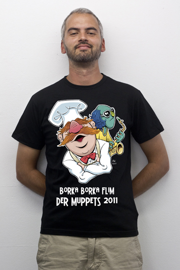
Go and check out the extraordinary Muppet fan site ToughPigs who celebrate their 10th anniversary with an array of some extraordinary cool fan art. Lots of good stuff going on at the Muppet forums right now as we draw closer to the release of the new Muppets film. ToughPigs will head the coverage of this time of anticipation, I’m sure. Imagine running such an informative and entertaining fan site for ten years! I’m honored to contribute to this great event with this humble piece.
Category Archives: Illustration
Summer jobs
Vacation is just one day away, so I thought I’d share a couple of illustration jobs I did recently, before I’m off to foreign lands.
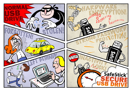
Text by Emma Agering. Loosing vital information through careless handling of unsecure usb-sticks is a big problem for companies worldwide. That’s why Blockmaster AB invented the Safestick Secure USB Drive! The illustration will be used for customer Powerpoint presentations, but you can also see the illustration on Safestick’s website, as well as requesting a free evaluation stick!
Ystad’s Allehanda is writing about two summer music festivals in the south of Sweden, Backafestivalen and Sommarrock Svedala, comparing the two. What guy would visit which festival in your opinion?
Hm, it’s raining outside my studio. I think I’ll just pack my bags and leave for sunnier latitudes. Au revoir and happy summer everyone!
The Muppets T-shirt Design Challenge cont’d
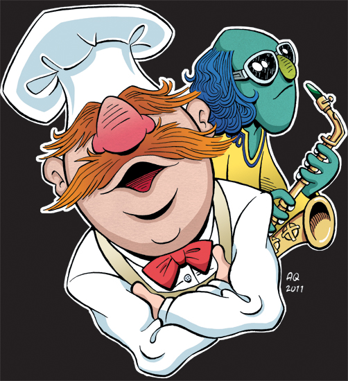
After scanning the inked drawing I colored it in Photoshop. To create clean files ready for printing I used the technique described in The DC Comics Guide to COLORING and LETTERING Comics. For some reason I always preferred stylized shading when coloring digitally. Sort of like cel shading with sharp lines. I don’t like the airbrush look. However, I added a few gradients for depth.
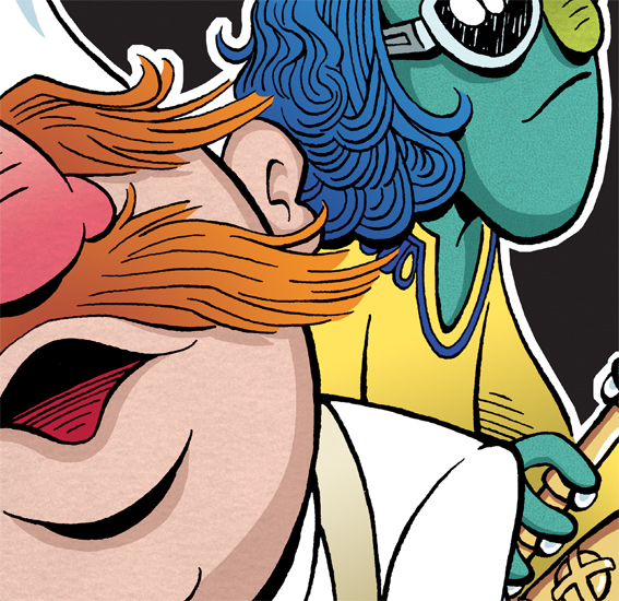
I just happened to have the very materials the muppets are made of at home – reticulated foam and antron fleece. I scanned these and added them as surfaces for the Chef’s face and Zoot’s skin.
As you may know, Jim Henson performed the Chef together with Frank Oz. One of Jim’s hands were in the Chef’s head, while his other hand and one of Frank’s combined to perform the Chef’s hands. I tried to mimic this by giving the Chef’s face an antron fleece surface, while the hands are plain [human skin]. Some incarnations of Zoot had him covered in antron fleece, while my favorite Zoot puppet had reticulated foam for skin (and a more greenish tone to it). Just to give you some measure of how nerdy I am. 🙂 And as you can see I picked black for background color, thus adding a white contour to the drawing to make the lines come out.
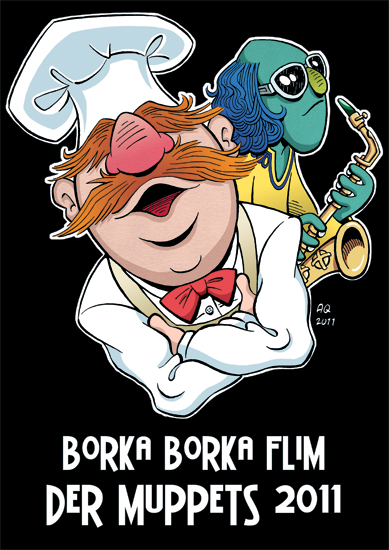
I took the image to Illustrator and added the text. The type I used is called BattleLines. I think I got it from www.blambot.com.
The final step was to mount the design on an actual T-shirt by some good ol’ Photoshop magic. Photo by my Södra Esplanaden colleague Lasse Lazee Johansson. Then I registered for the competition and sent in my design. Go and check out the many cool entries at Threadless and keep your fingers crossed that they’ll accept my entry. If they do, I’m going to ask the whole world to vote for me. 🙂
To be continued…?
The Muppets T-shirt Design Challenge
I’m going to participate in the Disney/Threadless Muppets T-shirt Design Challenge (10 days left to submit!) for the upcoming Muppets feature film. Since it’s kind of modern to let people in on the creative process, I thought I’d post my way through the progression. Here we go.
The theme of the challenge is friendship. I picked two of my favorite muppets, Zoot (my fellow saxophone player) and the Swedish Chef (my fellow Swede). Perhaps not the obvious choice of muppet friends, but everyone else is going to do something on Kermit, Fozzie, Piggy, Gonzo and Animal, so why not? 🙂
I envisioned something fish eye-ish, that looked a bit like a record cover. Found this on the world wide web:
I used it as a starting point for skecthing.
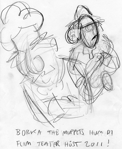
I usually make a bunch of doodles before getting into the nit and grit of “real” sketch work.
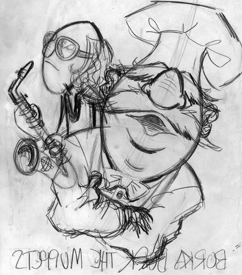
The final sketch. The reason it’s mirrored is that I use a light board and flip the drawing back and forth a couple of times, going over stuff several times to get the shapes I want.
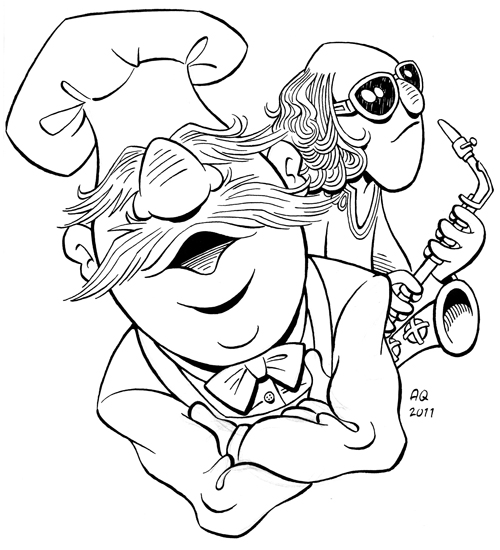
I put ink paper on the light board on top of the sketch. In this case I used a steel nib for inking.
Next step is coloring. Stay tuned…
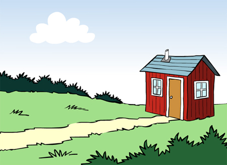
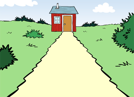
The path leads to the house, right?
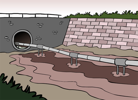
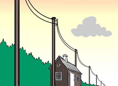
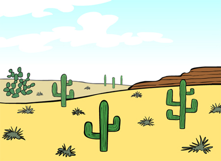
For a month or so I was working on a bunch of illustrations (37 altogether) for a linguistic investigation. PHD scholar Johan Blomberg is writing his thesis on how we use verbs of motion to describe images.
“The path LEADS to the house” is such an expression.
Or does it lead FROM the house?
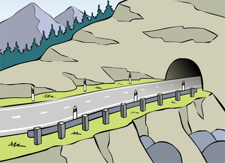
I was asked to vary the perspective from 3rd person to 1st person. Is the road going INTO the tunnel, or is it LEAVING it?
You get the picture. The majority of the illustrations have some sort of linear element in them that the eye can follow. Participants from different countries and cultures will be asked to describe the images in their own words.
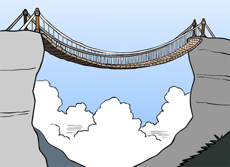
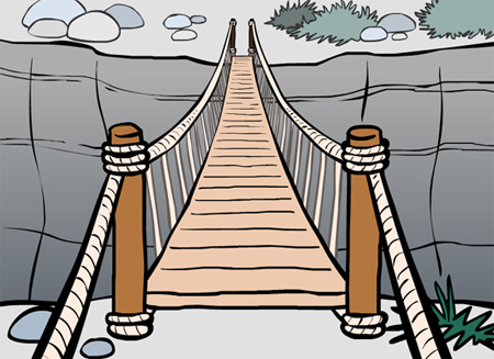
Does the bridge CROSS the ravine? Does it LEAD to the other side?
Are there alternative ways to describe these scenes? A couple more samples:
Johan will also investigate how the human eye scans images by filming the eye movements of the participants (!).
The illustrations were supposed to be culturally nonspecific, clear and easy to read to anyone. At the same time Johan didn’t want them too boring. They weren’t supposed to look like schematic drawings from a scientific book. So a bit artistic, but not too artistic. Also the budget required me to make about four of these a day. Efficiency was key. Who could say no to such an interesting challenge?
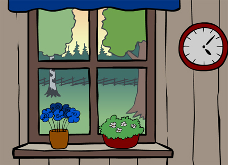
Some pictures were supposed to be void of linear elements like roads, bridges and telephone lines. The chronology of the illustrations will be somewhat shuffled in the investigation. The participants shouldn’t be able to calculate what the next image will be.
With these “control images” it was especially hard to not draw pretty pictures. A cartoonist tends to want to have fun when he can.
In the end I did not make four illustrations a day. Rather two, or even one. But I developed an illustration technique using Flash that is at least semi-fast. Illustrating in vector makes it so easy to edit. If you set it up properly, you’re free to move around objects, deform them and resize everything as you wish.
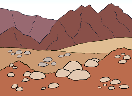
I guess I didn’t succeed in being culturally nonspecific either. I found that super hard. Maybe some cartoonists would be able to do this from the top of their heads, but I at least need reference to make believable pictures. Can you guess from where I got this mountain scene?
All in all, this was an interesting and different illustration assignment. I enjoyed it and I think I learned something in the process. I’m curious about the results of Johan’s investigation. I wish him the best of luck!

