Big Time Swing!

Last year, Bobbe Big Band turned 10 years. To celebrate this, we recorded and released our first album called Big Time Swing!

6PAN1T-C.indd

I caricatured our amazing solo singers Marie Nagenius and Carl-Johan Killeslätt, as well as our musical director (and dear friend) Robin “Bobbe” Hellström. I wanted a “retro feel” to this cover, to go with the swing music. The inspiration comes from cartoons of the 50s, whereas the actual music is mainly from the 30s and 40s, so it’s entirely wrong actually. 🙂

The reason the cover looks cool is entirely thanks to Alfred Beckman (another dear friend) and his bold graphic design. He picked the colors, designed our logo, designed the title and so on. As always, working with Alfred lifts the whole thing to heights that wouldn’t have been reached otherwise. Nice work man!

In fact, thanks to the cool cover (and the music), our CD is now sold through the hippest store of the hip, HepCat. There are still some copies left, so if you want a great swing record to dance to, go ahead and order your copy of Big Time Swing from HepCat!

6PAN1T-C.indd

Yet another dear friend, Ted Johansson, shot the band picture. It’s from a concert with Swedish guitar legend Janne Schaffer last year. Thanks Ted for all your great pictures from that concert!

6PAN1T-C.indd

Being part of this group has brought me so much joy and great musical experiences through the years. I’m looking forward to celebrating 20 years with you guys. Thanks!

Gogo Hayes

gogo_klar

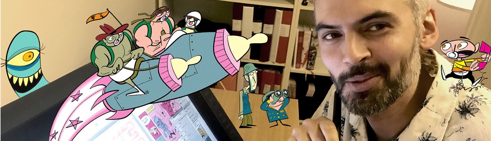
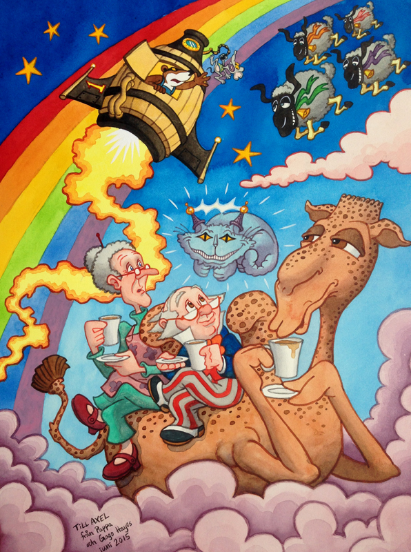
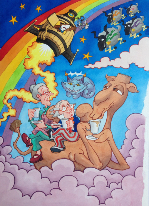
We’re currently waiting for our second child. Our first born is now 2,5 years. I wanted to give him something special as a token of my appreciation of being his father. I was on parental leave with him from when he was 1 to ca. 1,5. During that time we started watching Dr Snuggles, a childhood favorite of mine created by Jeffrey O’Kelly and Nick Price, on DVD. At first it was a bit much for him to digest, but gradually he got into it, and then for some months he didn’t want to watch anything else. Sometimes several times a day, and he’d talk constantly about these strange stories and characters. There are only 13 episodes all together, so the family kind of know them by heart now. He used to call Dr Snuggles “Gogo Hayes” back then. I thought I’d make a painting for him, to remember the good times we spent together in that weird and magical world. Above you can see the end result. If you’re interested, here’s how it was made.

gogo_doodle1
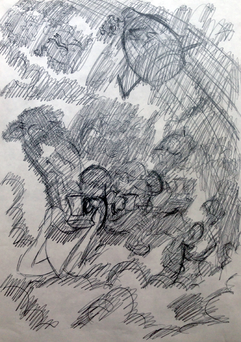
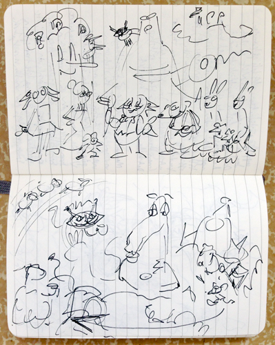
I usually start with doodles in my sketchbook.

gogo_doodle2
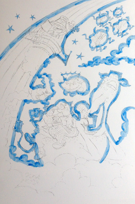
I always loved the spotted camel Woogie (Puckli), sitting in the clouds sipping his tea, so I decided to set the scene there.

gogo_preliminarysketch

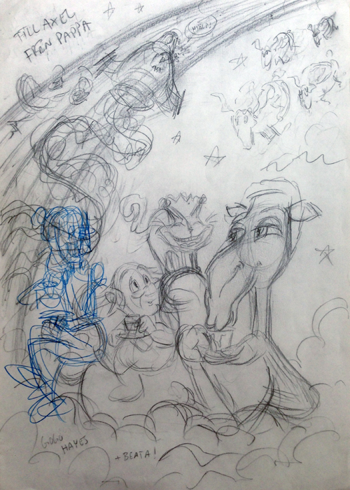
The preliminary sketch (A4). I decided late on to include Miss Nettles (Beata).

gogo_finalsketch

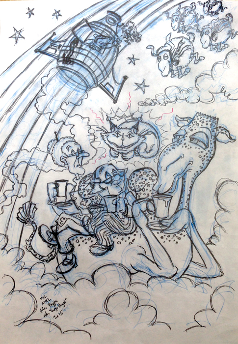
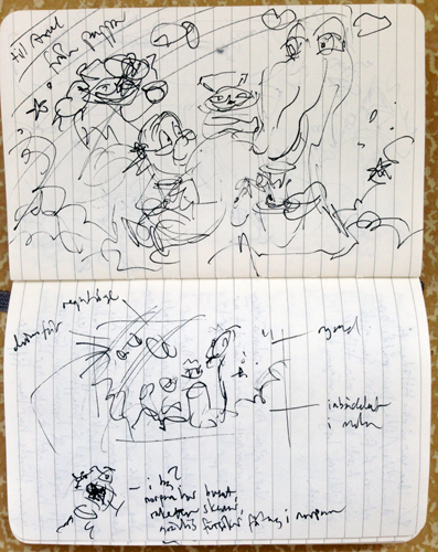
The final sketch before moving on to painting.

gogo_blyertsbaksidan

To get the sketch onto water color paper, I pencilled the backside, then put the sketch on top of the water color paper, retracing the lines on the front. Probably a stupid way of doing it, but at least it worked.

gogo_maskingfluid

First thing I did was covering the details with masking fluid.

gogo_himmel

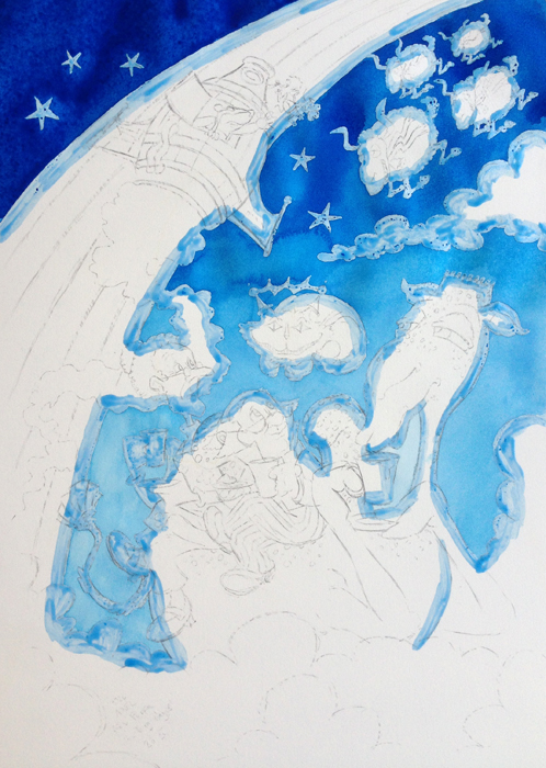
Aided by masking fluid you can make nice gradient skies, not having to worry about the detailed elements. Turned out far from perfect as you can see. But that’s one of the things I enjoy with water color. Not being fully in control. There’s an element of “it is what it is”.

gogo_flatcolors

Applying flat fields of color. When doing water color you start with the lightest parts, then gradually going darker. I guess that’s the opposite of what you would do with acrylics or oil, but since I’m not a painter I wouldn’t know really.

gogo_sprutti

Started adding shades and tones. With this painting I wanted to step away from my usual minimalistic ideals and make something more lavish. That’s quite a challenge with water colors which usually lend themselves to kind of light renderings. I started with the rocket Dreamy Boom Boom (Sprutti Bang-Bang) to work out the level of “spiciness”.

gogo_outlines

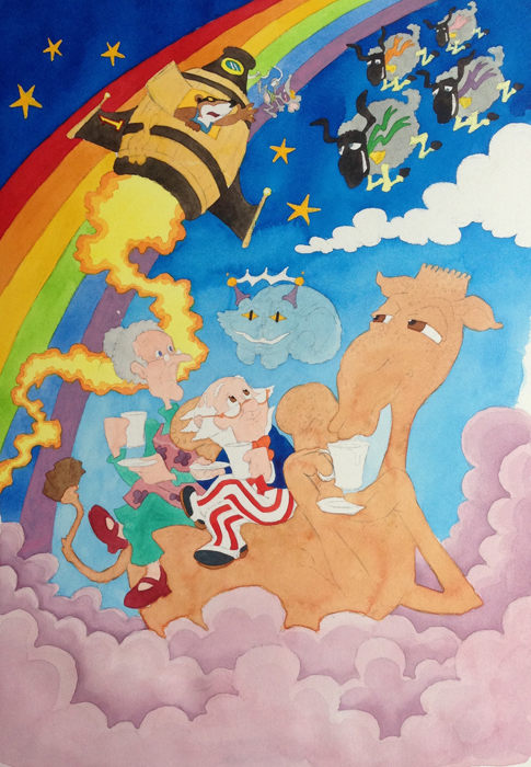
Added colored outlines to the main components. That’s not really “painting”, but the idea was that it would force me to go even more “spicy” with the shading and tones, i.e. try to bring the shading so close to the opaqueness of the outline that you wouldn’t really think about the outline.

gogo_klar

I went over it again and again until I ended up with this and decided that’s it. Like any creative work you’re never really “done”, you just have to decide when to stop. The white spikes underneath Dreamy Boom Boom as well as the lines around the Cosmic Cat are gouache. The rest is pure water color.

gogo_bortskuren

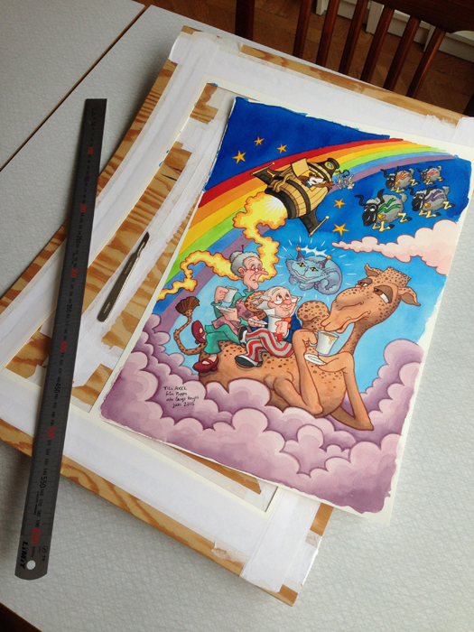
When doing watercolors you really benefit from mounting the paper properly on a board. That way you avoid buckling from the water, which can make the paint/water gather in pools where you don’t want them to. My favorite part of water color painting is when you get to cut it off from the board, and you end up with a flat paper.

My son discovered the finished painting in my home office. Big eyes. He clearly recognized these guys, but he got a bit shy and didn’t want to say who they were (usually he talks a lot about them). He wanted to touch the characters, which he wasn’t allowed to (water color is sensitive to moisture). Still I thought of that as a good sign. Like he wanted to pick them out of the picture and play with them. The painting is currently at the frame shop waiting to get mounted. I hope it will be a treasured item for him.

I guess this means I’ll have to make something similar for his sibling. This one only took me a week, and I’m going to have sooo much time from now on…


Illustration: taking a new turn

Looking for a new direction in the way I illustrate. Some recent examples:

Print

Print

Two ways of telling a patient he or she suffers from a fatal disease. Illustrations for a lecture at Palliative Centre Lund, part of Region Skåne. Commissioned by Kolossal AB.

svärmor

tonåringar

gäster

Potential sources of conflicts in and around the summer house. 1) Your Mother in law stays too long, 2) A parent is excited about spending some weeks at the countryside whereas the teenage kids rather would’ve stayed in town, 3) one partner wants peace and quite to work on the house whereas the other wants to socialize with guests. Allt om Fritidshus, Bonnier Tidskrifter.

Making a carnival poster

16-18 May it was once again time for the quadrennial Lundakarnevalen (The Lund Carnival). I was part of the 2002 carnival and the 2006 one. This time, with quite a few years of distance from student life, I entered the official poster competition. Mine was one of five entries that reached the final. I didn’t win. However I enjoyed doing this competition. I found a style and a way of working that I liked. The theme of the carnival was “futural” (futuristic, kind of…). I wanted to make something that reflected Lund’s peculiar mix of conservatism and progressivity. I started out with lots and lots of doodles and ended up with this final sketch, done in Photoshop:

karneval_skiss

I always loved Back to the Future, the scruffy Delorean being able to travel in time and fly and what not. Thus I chose a “retro” cartooning style (50s-ish) with a futuristic subject matter (a flying old fashioned tram). The vector art was done in Illustrator. A lot of thought went into this: two students one of each sex, the Lund University lion, the logo resembling electricity fueling the tram, the cathedral, the flying retro cartoon cars, the transsexual cyclist, the pride rainbow, the computer motherboard texture in the background etc. I wanted it all in there and ended up with something quite messy:

futuralkarneval_qassim131011It got me into the final at least! The committee’s critique was basically “try to remove some stuff and find a better font”. Their critique was entirely justified. So I spent a day or two removing stuff and looking for easier to apply, non-homemade fonts. My good ol’ friend Alfred Beckman helped me a lot during this process. Thanks Alfred! Your generous input always improves my work! I ended up with not one reworked entry, but four:

futuralkarneval_131111_4_1

futuralkarneval_131111_5

futuralkarneval_131111_6

The committee really liked the transsexual student on the old-fashioned bike, so I made one version with him/her as the main graphic object rather than the tram. Maybe it’s the best one? I like the simplicity, but I think however that this one is my favorite:

lackalŠngakarnevalI put this one in my online portfolio before the carnival, thus I changed the name, so there would be no confusion with multiple carnival posters circulating the net. Which one of these is your favorite?